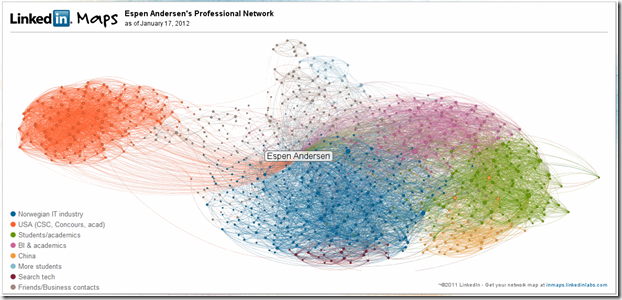
LinkedIn Maps is a fascinating service that lets you map out your contact network. Here is my first-level network, with 848 nodes (click for larger image):
The colors are added automatically by LinkedIn, presumably by profile similarity and link to other networks. You have to add the labels yourself – they are reasonably precise, at least for the top five groups (listed according to size and, I presume, interconnectedness).
As can be seen, I am a gatekeeper between a network of consultants and researchers in the States (the orange group) and reasonably plugged into the IT industry, primarily Norwegian (the dark blue). The others are fairly obvious, with the exception of the last category, which happens to be an eclectic group that I interact with quite a lot, but which are hard to categorize, at least from their backgrounds.
Incidentally, the “shared” map, which takes away names, provides more information for analysis. Note the yellow nodes in my green network on the right: These are the people hired by BI to manage or teach in China. They are, not in nationality but in orientation, foreigners in their own organization.
My LinkedIn policy is to accept anyone I know (i.e. have had dealings with and would like in my network), which, naturally, includes a number of students (I will friend any student of my courses as long as I can remember them, though I must admit I am a bit sloppy there.)
What is missing? Two things stand out: I have many contacts in Norwegian media and in the international blogosphere, which isn’t here because, well, Norwegian media use Twitter or their own outlets, and bloggers use, well, their blogs. Hence, the commentariat is largely invisible in the LinkedIn world (except for Jill Walker Rettberg, who sicced me onto LinkedIn Maps). Also, a number of personal friends are not here, simply because LinkedIn is a professional network – and as such captures formal relationships, not your daily communications.
Now, what really would make me curious is what this map would look like for my Facebook, Twitter and Gmail accounts – and how they overlap. But the network in itself is interesting – and tells me that increasing the interaction between my USA network and the Norwegian IT industry wouldn’t hurt.

